Yes, the difference between those two pictures is significant. I assumed that the first was taken with a camera with auto white balance, and that it changed the warm colour to look more like a straight white. In the 2nd picture I adjusted the white balance so the colours shown match the Dulux colour codes. Then all the following pictures have the Dulux codes for the other colours.
The other thing is that different displays are colabrated differently, and for different light sources. So it's all very rough, and as Michelle says, the best indicator is a pot of paint. But if you can find a display and lighting conditions that the 2nd picture matches what you see in reality, then under the same conditions the other pictures that followed it should give a fair indication as well.
If the 2nd picture doesn't match the real wall, then the others won't either.
WatchingStarredHistory
MembersPros
Browse Forums Interior Decorating Lounge Re: Render colour advice 23May 20, 2015 8:19 pm Its in the same colour family only darker, well done!  Internal and External Building and Colour Consultant Online - Worldwide http://www.denovoconcepts.com Re: Render colour advice 27May 21, 2015 6:35 pm Nice.... where did you buy your paint from? Internal and External Building and Colour Consultant Online - Worldwide http://www.denovoconcepts.com Re: Render colour advice 28May 23, 2015 6:33 pm From our local Dulux inspirations paint shop. Bunnings stock it too. We also found another new color in the Dulux range which we are considering, have you heard or seen "Aura" Michelle? I'll post a pic tomorrow after we finish painting the sample. Re: Render colour advice 30May 25, 2015 6:22 am No....not so good there. At least you're giving the sample posts a go it makes a difference. Don't throw throw the sample pots out, they are good to paint the inside of terracotta pots to stop them from being so porous Internal and External Building and Colour Consultant Online - Worldwide http://www.denovoconcepts.com Re: Render colour advice 31May 25, 2015 9:32 pm  Michelle MichelleNo....not so good there. At least you're giving the sample posts a go it makes a difference. Don't throw throw the sample pots out, they are good to paint the inside of terracotta pots to stop them from being so porous Thanks Michelle, Another colour question for you, what do you think of Self Destruct for render, is it too yellow, I came across some old threads on here mentioning this? Went to Dulux to speak to their consultant again today and she recommended Self Destruct if we think Gnu Tan is too dark. I also spoke to our renderer and he really likes Warm Neutral says it looks great rendered , between these 3 colours he agrees they will all look good. I like all the colours too, just think Gnu Tan is too similar to our bricks and might not contrast enough, but then it does have the contrast of Woodland Grey windows and roof so perhaps it would look ok, so confusing....  it does look lovely in the sun! it does look lovely in the sun!What would be your preferred colour out of Warm Neutral, Gnu Tan or Self Destruct?  Re: Render colour advice 32May 26, 2015 6:03 am I think they are are all too yellow for your bricks. Like ⋅ Add a comment ⋅ Pin to Ideaboard ⋅ [quote="MT70"] Like ⋅ Add a comment ⋅ Pin to Ideaboard ⋅ Internal and External Building and Colour Consultant Online - Worldwide http://www.denovoconcepts.com Re: Render colour advice 33May 28, 2015 8:37 am Based on the earlier photo that I tried to calibrate, the overall brick colour seems to be close to Dulux Baton (P12D7). That's on page 12, and is more towards the reds rather than green. To match that toning, you'd be looking more at: [P12D4] Shattell [P12C4] Parador Inn [P12C3] Puppy Re: Render colour advice 34May 28, 2015 8:58 am Thanks oneJohn I'm getting really confused with these colours. ..
We have to decide tomorrow. I'll check out your suggestions. (Possibly a bit too dark for my liking I do recall looking at puppy). Based on mine so far I prefer warm neutral. Re: Render colour advice 37May 28, 2015 10:08 am [quote="Michelle"]I think they are are all too yellow for your bricks. http://i637.photobucket.com/albums/uu98/bellao4/dulux%20colours.jpg thanks Michelle, so should I avoid all colours on this page? At least Warm Neutral isn't on here so that might be the one I pick. Really want a nice contrast with woodland grey . I'll post another pick of a house today I like the render on to see if anyone could suggest what the colour could be. thanks Re: Render colour advice 39May 28, 2015 5:10 pm Time Capsule and Parador Inn are very similar. Both are similar darkness to Gnu Tan, but a bit greyer, and a bit more red and less yellow in tint. Time Capsule is very slightly darker than Parador Inn, and slightly further to the yellow direction. I have a feeling the photo you posted is Paperbark render. The house in this post is in Paperbark render: viewtopic.php?p=581867#p581867 Paperbark is close to Self-Destruct. Based on your bricks though, I'd move a little further away from Yellow. That takes you to Warm Neutral and then on to Puppy. This will be quite similar in appearance, but should just match to the bricks a bit better. Based on what you've said in your posts so far, you find colours like Mud Puddle, Gnu Tan to be too dark, so I think the colour you're after is either Warm Neutral or Puppy. Given that you've pained the Warm Neutral and like it, I think it's the safest choice. Re: Render colour advice 40May 28, 2015 9:13 pm 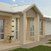 oneJohn oneJohnTime Capsule and Parador Inn are very similar. Both are similar darkness to Gnu Tan, but a bit greyer, and a bit more red and less yellow in tint. Time Capsule is very slightly darker than Parador Inn, and slightly further to the yellow direction. I have a feeling the photo you posted is Paperbark render. The house in this post is in Paperbark render: viewtopic.php?p=581867#p581867 Paperbark is close to Self-Destruct. Based on your bricks though, I'd move a little further away from Yellow. That takes you to Warm Neutral and then on to Puppy. This will be quite similar in appearance, but should just match to the bricks a bit better. Based on what you've said in your posts so far, you find colours like Mud Puddle, Gnu Tan to be too dark, so I think the colour you're after is either Warm Neutral or Puppy. Given that you've pained the Warm Neutral and like it, I think it's the safest choice. Hi oneJohn, Wow thanks you are so knowledgeable with paint colours! First, I need to correct myself now that I looked up your colour suggestions again on my laptop screen and realised the colours were quite different from my phone earlier. Dulux Shattell, Parador Inn and Puppy - not too dark at all. We did like Gnu Tan just felt it was too close to our bricks, it's almost a perfect match, whereas we want a bit of contrast but I don't mind the depth/tone of the colour as such. Yes I still love Warm Neutral but when we were looking at the sample patch in the sun today, my hubby felt it was a bit too light. Hence thinking of going a bit deeper with something else, looking at the Shattell seems quite nice would you compare it to Warm Neutral but darker? Perhaps I should just do WN 1.5 strength? I quite like Parador Inn too. So what is the base of say Shattell and Parador Inn, are they a grey toned brown? Oh and how do you compare Shattell to Clay Dust (that was another thought to darken the Warm Neutral) I'm off Time Capsule now. Which would you think would work best with our bricks and Woodland Grey? Sorry for all the questions We also found a Berger paint, Safari Dust, which is exactly like Warm Neutral less a bit of the pink, painted a sample and it is really nice but still on the light shade, not that I mind too much it will look great in the shade!! Hmmm decisions decisions..... Versaloc is a mortarless besser block system that still needs a properly engineered footing. If you just do a 400x200 footing it will fail in time. At 17m long you need it… 1 17248 Hi Alex, Thanks for the reply again. I had a chat with the builder, he said he will use primer, then hydrotec which comes with colour and sealer as well. A Renderer I… 12 18059 |
